Solarwinds NPM is an excellent monitoring system with many different modules that do just about everything. As a long time user of the platform, I’ve spent years designing and coming up with new ways to build good dashboards. In this post, I’ll go over how to create some dashboards on the home page that shows you pretty much any of your issues at a glance when configured right, and some other dashboards that utilize powerful charts. (Note this article assumes you know your way around Orion’s configuration and interface).
First, here’s a look at the dashboard on my home Summary page, with some sensitive information redacted;
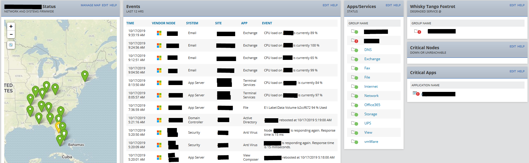
The Worldwide Map
There are four columns on the page, each with one or more resource/widgets added to them.The first column contains the built-in worldwide map that comes with NPM. Out of the box it doesn’t do much, but here I’ve set it up to display the status of Groups. In my case, each group is actually a physical office location. The worldwide map is fully interactive, and allows you to zoom down to the items on the map, as well as hover over the balloons for info.
To display items on the world map, the node or group has to have a latitude and longitude property assigned to it:
Create a group for your first location, then populate the group with nodes and devices Orion is monitoring. You can use a dynamic or static list. I use dynamic lists, so that any node added with certain properties is automatically made a member of the group/location.
After the group is setup, you will need the GPS location. I use https://www.gps-coordinates.net, where you can input an address and get the longitude and latitude. Make note of the values.
In Orion, go to Settings > All Settings > Manage Custom Properties and select both the ‘Latitude’ and ‘Longitude’ properties for Groups and click the View/Edit Values button. If these are missing you may need to create them. Just make sure they’re Floating Point Numbers as shown;

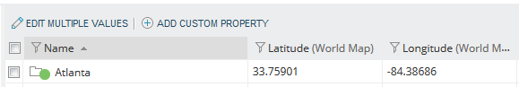 Add the coordinates for the Group to the Latitude (World Map) and Longitude (World Map) fields.
After saving changes, go back to the Summary page, edit it, and add the Worldwide Map resource to the first column.
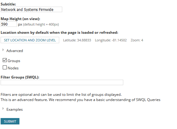 Once it’s on the page, select the ‘Edit’ link in the upper right, and check the box to display Groups.
You should now have the world map displaying the groups as balloons just like the screen shot. You can also set the zoom location and level, so that it appears exactly the way you want when the page is loaded.
The Events List
In the second column of the Summary screen, the events from the last 12 hours is displayed. This is a custom report that pulls the entries in the NetPerfMon Event Log. When you configure your alerts, you can add an action that will write to this log. There are several canned alert types it uses, and the report is configured to get all of the ones we care about, including our triggered alerts. This gives you a running status of the events and your custom alerts on the home page.
App/Status Widget
In the third column is a customized Group status widget showing the status of another set of groups. Instead of representing office locations, these are all of the critical apps and services grouped together. These are made up of nodes and SAM application monitors.
 For example, all of my DNS servers and any app monitors for them are placed in the ‘DNS’ group, and so on. Once you have application groups in place, you will need to update the group description so you can use it to filter the widget’s display to only show your apps.
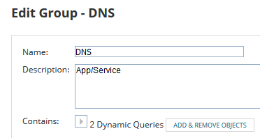
Edit the group from the Group Summary page and add ‘App/Service’ to the Description field.
![]()
Now add the Groups With Problems widget to the third column, then edit it and check the boxes for Up, Down, Warning, Unreachable, and Critical. Then add to the filter field as shown to see only your app groups.
Whiskey Tango Foxtrot
As the name (hilariously) implies, this is a custom group status that shows something is wrong! It’s the exact opposite of the last group that was setup. It filters for all the groups that are offices. Just set the office group descriptions to “Office” or some other keyword, then add the Groups With Problems widget and filter it the same way you did in the last step.
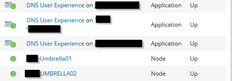
The final two widgets are the built in ‘Nodes With Problems’ and ‘Applications With Problems’ lists, and shows any down node, and any down/warning SAM monitor.
All rolled together on the page, this gives us a pretty good overview. In the next post of this series, we’ll dive into playing around with one of my favorite Orion features; Perfstack!