In the first part of this series on building Solarwinds Orion dashboards I detailed how to build an effective home page showing some of the valuable info coming into the monitoring system. In this long awaited next part, I’ll show a page view with charts and some other data for network interfaces and devices in multiple locations. If you have an infrastructure that spans sites, datacenters, or offices, then this can be a valuable way to present these metrics in a single pane. This also highlights one of the most powerful recent features to come to Orion, a charting tool called Perfstack.
First, this article assumes you have some knowledge on the basics of Orion, especially adding resources to pages, filtering them, creating charts in Perfstack, and an understanding of the different Orion modules.
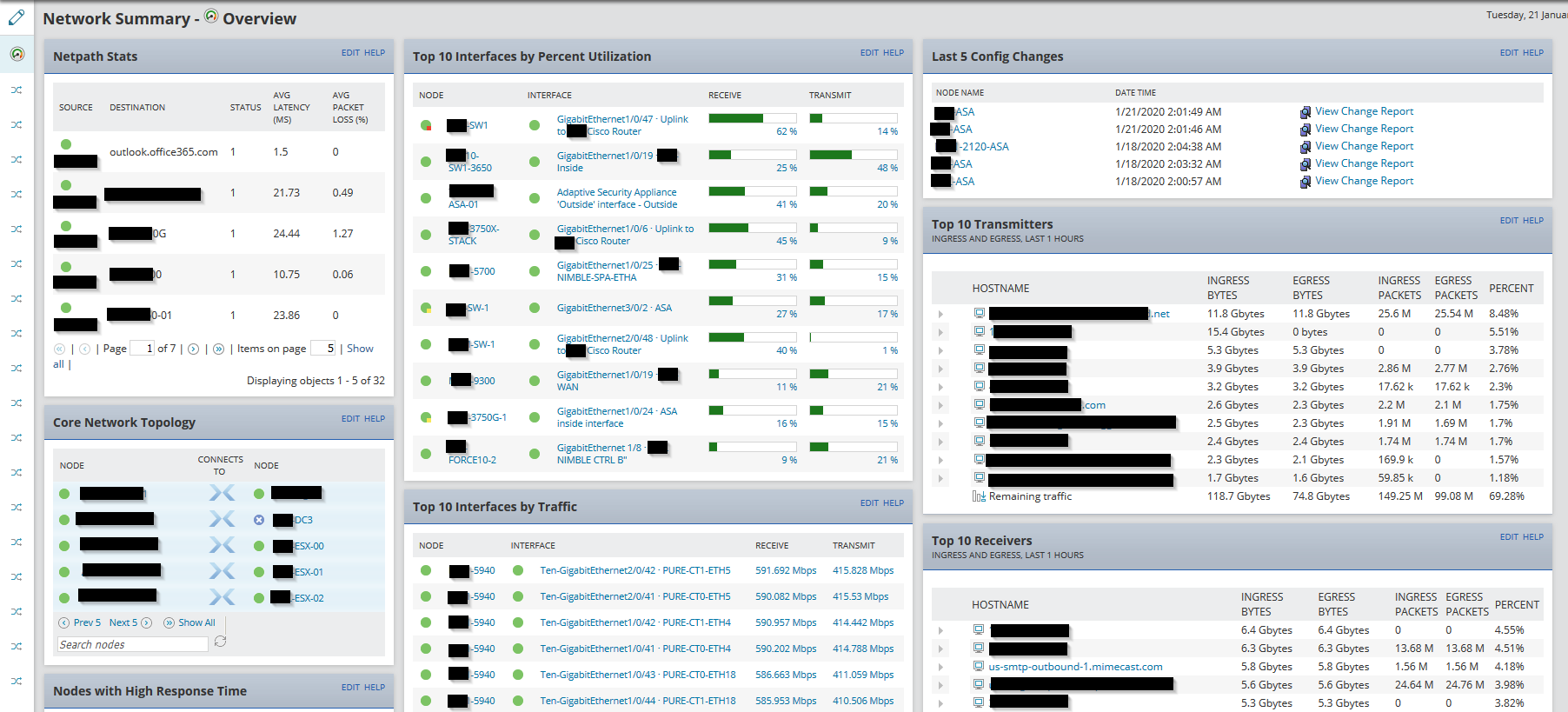
To start with, I reworked the default NPM Summary page by removing/adding resources I wanted. Really, what you place here is up to you. The idea is an overall view of what’s important in the network stack(s). Currently I have a full list of all the NetPath stats, the last 5 config changes from Network Configuration Manager, the top 10 transmitters and receivers from Netflow Traffic Analyzer, and a few other canned network resources like top 10 interfaces. Again, place whatever works for you here. The real magic is in the next step.
After I customized the main summary page, I added a new tab to the left of the page. In my case, I’m using the city name of a remote site/office as the name for the tab. You should now have a new empty tab that slides out from the left of the Network Summary Overview page.
In this scenario sites are connected via MPLS, have a dedicated internet connection, and those connections end at interfaces on an internal switch. In Perfstack, I built three charts. Each chart has a specific set of metrics, with the first showing MPLS traffic. The first chart in column 1 has Avg Rcv & Transmit Bandwidth for the MPLS interface, along with utilization, discards, and errors.
The second chart in column 2 has the same metrics for the internet interface. The third chart in column 3 is a performance roundup of the network switch. It includes the average cpu load and memory use, average response time, availability, and packet loss of the device.
Finally, for the fourth column on the page I added a custom NetPath Summary and interface details for all monitored interfaces in that site. The Interface Details resource is filtered using a custom “City” or “Site” property assigned to the node to show only the metrics for that site.
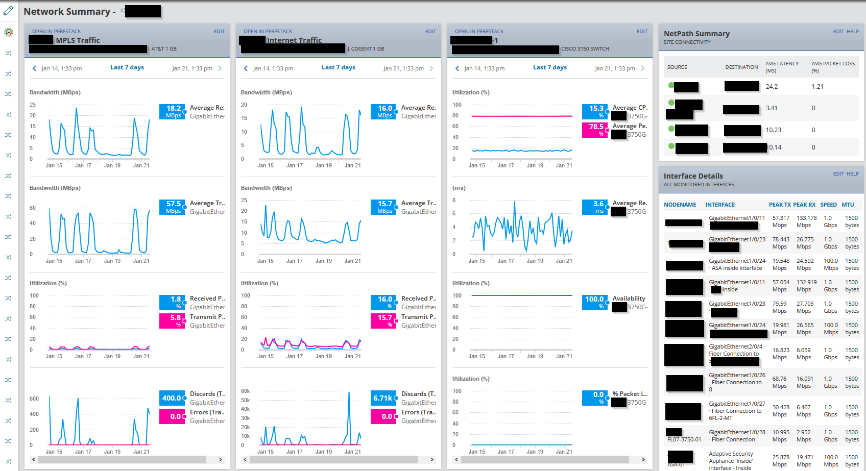
Once the charts are completed, you can add them to the tab created earlier on the Network Summary page. You can add tabs for all the sites you might have. This provides one place to reference NPM stats for multiple locations. The Perfstack resources allow you to change the interval right on the page and open the chart in the Perfstack interface if desired.